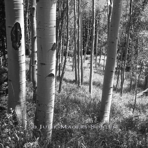
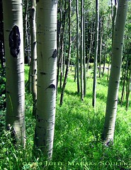
 You might recognize this photograph. It is not entirely new to my portfolio. What is new is the presentation. I was recently requested to change a couple of my most popular color photographs to black and white. And to make things even more interesting this person wanted squares. I love a challenge so I said I would play around and see what happened. The original photograph is here too so that you can compare. Tell me what you think.
Thank you Mark in southern California for being my muse!
Aspen Light BW
My Colorado photography studio is featuring a black and white photo of an aspen tree filled meadow with their white bark dappled in light.
click here for purchase information on this photograph
My Colorado photography studio is featuring a black and white photo of an aspen tree filled meadow with their white bark dappled in light.
click here for purchase information on this photograph
Here is the original color and crop of the fine art photograph, Aspen Light.
click here for purchase information on this photograph
click here for purchase information on this photograph
| Etsy JulieMagersSoulen |


That's so beautiful - I really like it as a black and white print.
ReplyDeleteBeautiful, it looks great as a black and white image. And square suits it too.
ReplyDeleteI love the aspen photo and do like your new presentation but I'm still a color gal so really like the original. All your work is gorgeous though!
ReplyDeleteIt works very well in B&W and with the square crop. Good work!
ReplyDeletePersonally, I prefer the color version, but that's just me.
Peace, Judi
http://judifitzpatrick.etsy.com
i really like your photo in black & white. it adds a certain quality that color can't. hope all is well. have a great night.
ReplyDeleteI really appreciate the feedback! Seems like we are leaning 3 black and white and 2 for color. Good to know! I love playing with black and white. It is such a different way of approaching photography for me. Thanks again!
ReplyDeleteI love black and white photographs. They always looks so classic and can look so completely different from the original counterparts.
ReplyDeleteVery beautiful Julie!
xo Catherine
I'm leaning towards the black and white, but it could be because the shot is larger.
ReplyDeleteI must say that the tree farthest left, looks like it has an ulcer and gives me a slight heebie jeebie feeling. LOL