
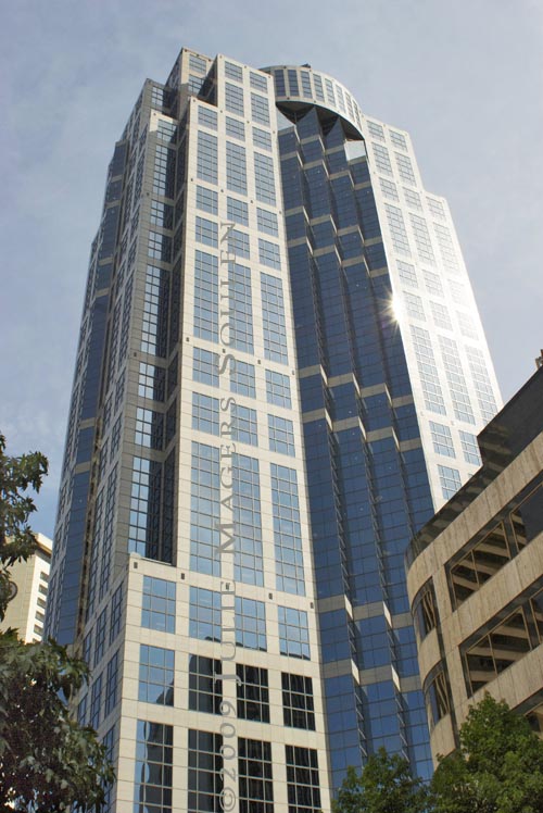
Hi everyone! I need your help. I have two images of the same building and would appreciate your feedback. Let me know which one you prefer. Number 1 is a more traditional presentation, while number 2 is a bit more contemporary with composition and color. What do you think? Which do you prefer?

| Etsy Buy Handmade JulieMagersSoulen |


I'm not sure what #1 or #2 but I like the version with the sepia like toning without the trees and other buildings. Something very stark and alluring in its appearance and composition.
ReplyDeletePretty cool that the building is named after you. . .ok, thats your watermark;) kidding. . .
Lovely work as always.
I go for the sepia tone #2?
btw, I feel like a lost little square face amongst the multitudes following now :)
I like the sepia toning better. It seems more powerful and intense.
ReplyDeleteI like the starkness of the second one better but the sun reflection on the first one. Not much help, am I? :-)
ReplyDeleteHi Julie: Like the monochromatic feel of the 2nd, but love the blue reflections and light on the 1st. To choose one to frame, I would choose #2.
ReplyDeleteThank you all for your feedback! I think we definitely have a favorite so far.
ReplyDeleteI think I prefer the first one.. prefer the color there..=)
ReplyDeleteAnd I agree with Bonnie, I'll prefer the 2nd one for framing.
ReplyDeleteIt depends on what you are going to use it for. I do agree with everyone else about the second one. However... sometimes that is not what is best for the actual project that you are wanting it for.
ReplyDeleteI like the second one. More dramatic.
ReplyDeleteThe first one is warm. The second is cold. I love blue skys and sun, so I prefer the first. I appreciate both; the second probably makes more of a powerful statement. As one of your readers said, it depends on what its purpose will be. Let us know!
ReplyDeleteI hadn't thought of a purpose other than to please my audience. What say you? Would you frame and hang one of these, or perhaps you'd like it as a card, coaster, necklace. If you were going to purchase a photograph would you like a piece of art or something functional?
ReplyDeleteI think if I was going for art on the wall... I would go for number 2. If however I was a business in the building, I would want to frame the first one... Both are beautiful!
ReplyDeleteI am going to walk with the masses and choose #2 also, there's something really dramatic and quite eerie about it. Although I know very little about photography, I know what I like.
ReplyDeleteI agree with you MMM. The first one looks like a building lobby piece. However, my intent is to stir an emotional reaction with my photography. "I have nothing to declare" said, "there's something really dramatic and quite eerie about it." I believe that I succeeded! Thanks!
ReplyDeleteOkay, I'll go against the grain and pick #1! The second one reminds me of one of those movies showing the end of the world with no life in it. I'm more drawn to the colors and reflections of the first one.
ReplyDeleteTough decision! I do like the starkness of the sepia tone in #2...reminds me of the old movie The Fountainhead with Gary Cooper..don't ask me why!
ReplyDeleteThe first one is a photograph while the second is a work of art - kind of like a documentary versus a movie - if you want realism pick #1, if you want art, pick #2
ReplyDeleteI prefer the second image. It's more dramatic and has more of that sense of power that much modern architecture is all about.
ReplyDeletegogeous architecture....great pin indeed!
ReplyDeleteI like #2 the simplicity makes the architecture more imposing.
ReplyDeleteHands down #2. Has a sci-fi feel to it. (good eye!)
ReplyDeleteI must admit I much prefer the blue tones of the first picture - probably influenced by the fact that I'm not much of a 'brown' fan.
ReplyDeleteJulie I like the first photo best. I like the blue sky and the blue reflection in the windows. I've been thinking of Pikes Market then I remembered Columbus,Ohio has it's own North Market so that is where I went yesterday. Will probably have a post sometime next week.
ReplyDeleteWe have a few more admirers of number 1, but number 2 holds the lead for an "art piece". Not to worry number 1 fans. Realism in photography is still alive and well! You might enjoy my landscapes more for that reason. Thank you so much for your comments. Cheers!
ReplyDeleteI'm a fan of sepia pictures, so I like number 2 for artsy use for sure.
ReplyDeleteThe sun reflecting off the building on the first one looks nice too though :)
Hmmm I am torn. I love the color and the sun refection in #1, and I love how the building is alone in #2! I also like the sepia toning of #2! lol
ReplyDeleteNo. 2 I like the most because of the weather.
ReplyDeleteI wish to see the same building while the sun set.
I like that darn reflection on the first one too. Unfortunately, the angle of the second shot eliminated it. I did do a little more work on it today to accentuate the little bit of reflection that is there. Thanks for the feedback!
ReplyDeletedo u like art deco? u seem to know ur stuff about the subject
ReplyDeleteYes, I do like art deco. My original major in college was history of art.
ReplyDeleteJulie, I love them both. But because blue is my favorite color, I'm voting for the first one:)
ReplyDeleteMy son and I agree that we fancy #2. :) Yet another beautiful piece of art!
ReplyDeleteill go with the original..you can see the real beauty of your presentation.
ReplyDeletehttp://ampil070485.blogspot.com/
Number one just gained some ground! LOL
ReplyDeleteyou captured it so well, it could give you an attack of vertigo...
ReplyDeleteJulie I prefer number one.
ReplyDeleteBoth are great, but I'm a bigger fan of #2.
ReplyDelete